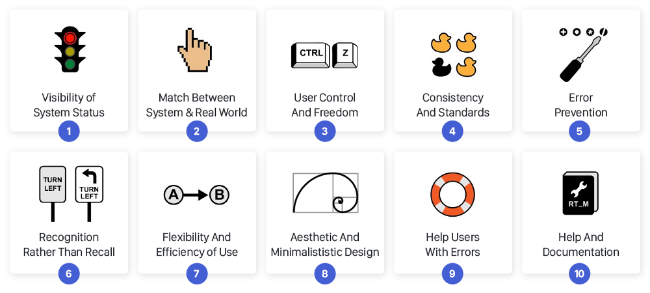
Jakob Nielsen coined the 10 Usability Heuristics for User Interface Design in 1994. They are called “heuristics” because they are broad rules of thumb and not specific usability guidelines.
 |
|---|
| The 10 Usability Heuristics for User Interface Design (https://uxdesign.cc/10-usability-heuristics-every-designer-should-know-129b9779ac53) |
These heuristics were formalized 25 years ago and is so common in products around us today, that we have started taken them for granted. These ideas are now deeply ingrained in modern-day customer experience that it is imperative that we adhere to them.
In this post, we explore the first 5 heuristics with modern-day examples. Part2 discusses the rest of the heuristics.
1. Visibility of system status
The system should always keep users informed about what is going on, through appropriate feedback within a reasonable time.
What does it mean?
The feedback given could be persistent or always visible such as the battery life or the wifi connection indicator. At other times, this feedback would be triggered by a user behavior such as on the click of a button.
It is not required to make all the backend system details visible to the user; provide only relevant and useful information. Feedback makes the users feel in control, avoids confusion and helps them make decisions. It confirms to the user that his/her action was recognized and the system is working on the request. It makes a system reliable and predictable which in turn creates trust.
Example
 |
|---|
| A browser indicating that it is loading a page. |
2. Match between system and the real world
The system should speak the users’ language, with words, phrases and concepts familiar to the user, rather than system-oriented terms. Follow real-world conventions, making information appear in a natural and logical order.
What does it mean?
Lean towards using words and ideas familiar to the user instead of using marketing jargon and technical terms. Also, the experience should align with what the user is familiar with in the real-world. Otherwise, it will add to the cognitive load for the user to interpret.
Skeuomorphic web design entails designing a digital experience to match a physical experience, both in visual and interaction.
Example
Amazon Kindle is a popular example of Skeuomorphic web design. In a physical book, the reader can turn pages, highlight text and bookmark pages. All these features are built into the experience of the e-reader, giving the user an experience similar to reading a physical book.
 |
|---|
| Amazon Kindle simulates the experience of reading a physical book. |
3. User control and freedom
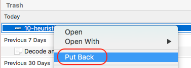
Users often choose system functions by mistake and will need a clearly marked “emergency exit” to leave the unwanted state without having to go through an extended dialogue. Support undo and redo.
What does it mean?
Giving easy exit options fosters freedom and confidence for the user to try something new. They know that if the action they take didn’t go as expected, they can easily go back.
Example
 |
|---|
| The back and forward buttons gives confidence to the user to explore. |
 |
|---|
| The “Put Back” button recovers previously deleted items from trash. |
4. Consistency and standards
Users should not have to wonder whether different words, situations, or actions mean the same thing. Follow platform conventions.
What does it mean?
Jakob’s law can help us understand the importance of following convention. Jakob’s law states that “People spent most of their time on sites other than yours”.
There are times when one does break the convention and that’s when one has discovered a better design. The trade-off here would be the improved user experience from this new design vs. forcing the users to learn something new. If the benefit is not substantial, it is better to stick to the standards.
Example
 |
|---|
| The convention in ecommerce sites is to place the shopping cart at the top right-hand corner. |
5. Error prevention
Even better than good error messages is a careful design which prevents a problem from occurring in the first place. Either eliminate error-prone conditions or check for them and present users with a confirmation option before they commit to the action.
What does it mean?
The system should be designed such that it helps the user avoid errors.
In critical transactions such as in finance or security, it is worth asking the user for confirmation before acting on a user request. For example, if the user places a fund transfer request, it is worth interrupting the user and asking for a re-confirmation before doing the transaction.
Example
If the reply and reply-all buttons are placed too close to each other without much distinction between the 2 buttons, there is a high probability that the user will click reply-all instead of reply and send the reply to unintended audience by mistake.
 |
|---|
| The placement and appearance of reply and reply-all buttons are important to avoid user clicking reply-all instead of reply. |
Reference: 10 Usability Heuristics for User Interface Design