Jakob Nielsen coined the 10 Usability Heuristics for User Interface Design in 1994. They are called “heuristics” because they are broad rules of thumb and not specific usability guidelines.
 |
|---|
| The 10 Usability Heuristics for User Interface Design (https://uxdesign.cc/10-usability-heuristics-every-designer-should-know-129b9779ac53) |
These heuristics were formalized 25 years ago and is so common in products around us today, that we have started taken them for granted. And so, it is even more important to follow them now than ever before, as these experiences are now deeply ingrained in customer experience.
Part1 discussed the first 5 heuristics with modern-day examples. In this post, we will discuss the rest of the 5 heuristics.
6. Recognition rather than recall
Minimize the user’s memory load by making objects, actions, and options visible. The user should not have to remember information from one part of the dialogue to another. Instructions for use of the system should be visible or easily retrievable whenever appropriate.
What does it mean?
Recognition gives users extra help in remembering information. Whereas, recall provides lesser cues to the users. Take the following example. To answer the question, “Is Lisbon the capital of Portugal?”, the user would use recognition. Compare this to the question, “What is the capital of Portugal?”, where the user would use recall to answer the question.
Minimizing user work is essential for good user experience, so that’s why recognition is preferred over recall.
Example
The menu option in Microsoft Word is an example of a recognition-based user interface. The computer represents the user with the list of available options and the user selects the needed option. This is in contrast with a command-line editor where the user has to remember the specific command to be able to enable a function.
 |
|---|
| The menu in Microsoft word displaying the various options. |
7. Flexibility and efficiency of use
Accelerators — unseen by the novice user — may often speed up the interaction for the expert user such that the system can cater to both inexperienced and experienced users. Allow users to tailor frequent actions.
What does it mean?
Accelerators are for experienced users and it enables them to complete routine tasks quickly. Highly usable systems are flexible enough to be efficient for experts and friendly to newbies. When this heuristic is done well, experienced users would not be slowed down by a system built only for the basic user and new users would not be overwhelmed with all the new information to learn.
Example
“Command-C” is a popular shortcut for copying a text. For someone who is not aware of this option or doesn’t want to use this option, the system offers the alternative of clicking on “Copy” in the “Edit” menu option.
 |
|---|
| The system offers the flexibility for user to copy a text by using “Command-C” or by selecting “Copy” from the menu. |
8. Aesthetic and minimalist design
Dialogues should not contain information which is irrelevant or rarely needed. Every extra unit of information in a dialogue competes with the relevant units of information and diminishes their relative visibility.
What does it mean?
The signal-noise ratio represents the ratio of relevant to irrelevant information. Aim for a high signal-noise ratio to improve the efficiency of designs. Prioritize the content to show only what is relevant. If something is not used frequently or not having much impact on the organizational goals, consider removing them. Visuals such as photos should be added only they serve a purpose and not just for aesthetics. “Communicate, don’t decorate”.
Example
 |
|---|
| Google is one of the best examples of minimalist design. |
9. Help users recognize, diagnose, and recover from errors
Error messages should be expressed in plain language (no codes), precisely indicate the problem, and constructively suggest a solution.
What does it mean?
- Inform users when an error has occurred. An error message could be combined with visual treatment such as a warning sign or red text.
- Tell users what the problem is.
- Offer a way to fix the error. The best thing to do is to offer a shortcut in the error message, not just instructions but also something that they can click right away to solve the problem.
Example
One example of this heuristic done well is in the Booking.com site. When there are no flights matching the search criteria, the system informs the users about the error and lets the user remove filters right away.
 |
|---|
| Booking.com giving the option to remove some filters to clear the error. |
10. Help and documentation
Even though it is better if the system can be used without documentation, it may be necessary to provide help and documentation. Any such information should be easy to search, focused on the user’s task, list concrete steps to be carried out, and not be too large.
What does it mean?
While applying this principle, consider the following:
- Is it easy to search for help?
- Is the documentation focused on the user tasks?
- Does the documentation list concrete steps to be carried out?
Example
Zerodha.com offers a search feature for their FAQ where the users can search for a question and the related FAQs pops up. These are easy to scan as they are phrased as questions.
 |
|---|
| The search of FAQs in Zerodha.com made easy. |
Amazon.com provides contextual help by assuring the user that they are not yet placing the order.
 |
|---|
| Contextual help by Amazon.com. |
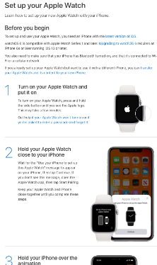
Apple.com provides concrete steps to be carried out to complete a user task.
 |
|---|
| The step-by-step documentation in Apple.com. |
Reference: 10 Usability Heuristics for User Interface Design