This article is based on my experience as a product manager redesigning a website for a multinational. This article covers the initial phase of the process until the executive approval is obtained to start development.
Need for the makeover:
The website had an outdated UI and a disjoint customer experience as 7 out of its 13 pages used an outdated version of the content management system and therefore had a different look and feel from the rest of the website. There was no way of tracking the customer journey as analytics was not available. In addition, there were performance issues which required major changes to the back-end architecture.
The 5 elements
1. Acquire the skillset
The in-house team maintaining the website didn’t have the technical know-how to revamp the website. Therefore, with the help of the engineer leads, we engaged UX designers, architects and additional developers.
The challenge was that skill in the needed technology was very rare and so we had to be content with borrowing resources from another team for a short period of time. This meant we had to turnaround the product rather quickly. Also, the in-house team had to ramp-up soon to be able to maintain the website once the experts left.
2. Conduct UX research and create UI mock-ups
Our UX designers conducted extensive customer and internal user interviews to understand major user needs, see the context in which the users were interacting with the website and finalise usability requirements.
Many a times, business requirements are handed down to us by the business team and there is no way of validating them. The UX research gave us the opportunity to hear directly from customers their pain-points and suggestions. Through the UX research, we saw how the current website was being used and perceived and what the major user needs were. It also helped reinforce the need for some new features which had become the industry standard but was lacking in our website.
The UX research team presented their findings and recommendations which helped in finalising and prioritising the usability requirements. Based on these recommendations and business requirements, the UX designer created the interactive UI mock-ups.
The challenge here was to obtain the contacts and approval for connecting with external customers. This being a large multinational, unlike a start-up, we had to get approvals before talking to customers.
3. Finalise UI mock-ups, user stories and prioritisation.
Next step was to review the UI mock-ups with the business and technical teams and make changes based on their feedback. The review with business helped confirm the business requirements and obtain buy-in on the UI mock-ups. The review with the technical team helped identify features and user behaviour which were not technical feasible to implement. The feedback from these reviews was taken back to the UX designer who made the requested changes. After multiple iterations, of updating the UI mock-ups and reviewing it with business and technology, the UI mock-ups were finalised and approved. User stories were created for each requirement.
As highlighted in the point around acquiring skillset, due to resource constraints, we were time-boxed to deliver the first release of the new website in a short period of time. Also, there was much uncertainty on the leadership approval for future releases. Therefore, the first version of the redesigned website had to be a complete solution, offering all the existing features at a minimum. In addition to the existing features, the team would take up user stories for new capabilities, based on their priority and the team’s bandwidth. Hence, prioritisation of user stories was of paramount importance.
The priority 1 user stories were the Minimum Viable Product in the redesigned website. This meant all the capabilities existing in the current website should be made available in the first version but with a new look and feel. The new capabilities were prioritised as 2, 3 or 4 depending on their importance to customer experience and revenue. For the p1 user stories which could not be delivered in the first release due to lack of bandwidth, we reworked with the UX designer and business team to create a more simplified experience.
The challenge with this step was that the current website had many capabilities spread across 13 pages. Every detail of every capability in every page had to be discussed extensively with the UX designer, business and technology teams. This required enormous number of hours in meetings and working in different time-zones as the teams were geographically dispersed.
4. Estimate and provide launch options
Now we had a list of prioritised user stories but a short period of time to deliver them. Before starting off with the development, we needed to know if the team could deliver at least all of the P1 requirements in the first release. Therefore, the technical team set out to estimate the effort for all the P1 requirements and provide a timeline.
After estimation, it became clear that it would not be possible to deliver all P1 requirements in the originally set go-live date. Further simplification of requirements, wherever possible, and re-negotiating with the UX designer and business did not help. To seek executive approval for further action, we put together 2 launch options which are shown below.
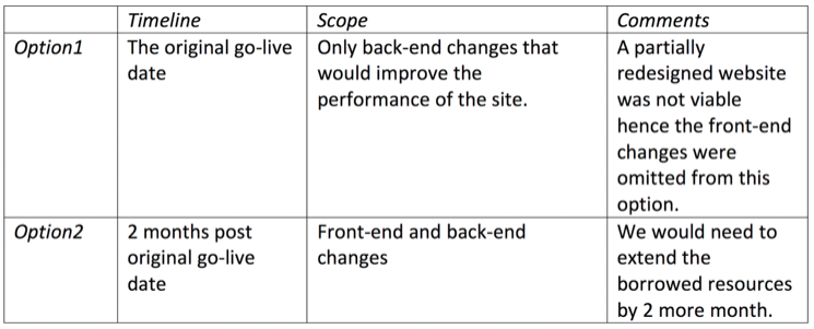
5. Obtain project sponsor and business approval
Not surprisingly, the fact that we couldn’t meet the original timeline to deliver front-end changes was not received well by stakeholders. It took multiple sessions to sensitise them on the complexity of the effort and the need for the additional 2 months.
Seeing the merits in option2, they preferred this option and helped obtain additional approvals to take the project forward.
What helped:
Given below are few aspects that helped me face the challenges in this project:
a) Building a good rapport with the team.
This being a complex project with many moving parts, there is bound to be misunderstanding and frustration among the stakeholders. Adding to the confusion was the fact that team members were from different cultural backgrounds and having different English accents and communication styles.
The PM, being the one who brings the various parties together has the important task of minimising such confusions and nothing helps more than the team having trust in the PM. The stakeholders are more open to conversation and understanding if they trust you and know you to be genuine. The time I had invested early on, in building a good rapport with the team, helped in difficult times.
b) Adjusting to time-zones
The business team was based in different time-zones in North America, the UX designers were in US and France and the technical team in US and India. Phases of the project such as UI mock-up review, user stories review, and prioritisation took several meetings and during early morning and late evening times.
c) Researching extensively for new capabilities.
The UX research and business requirements called for implementation of some new capabilities. Some examples of these capabilities are providing personalised recommendations based on user history and profile, identifying the ranking and blending requirements for displaying search results across different categories and defining success metrics.
To provide detailed requirements for these new capabilities, competitor analysis and attending training in these topics in Product management forums (link1, link2) and online learning platforms were particularly helpful.
Thanks for reading.